Monday, November 12, 2012

monday thoughts: in defense of pretty

Night Blooming Cereus by Sally Mann

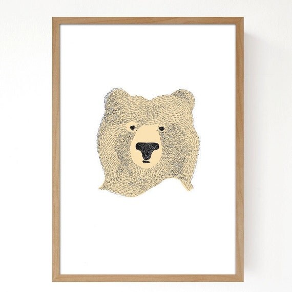
There are so many ways to label art. Is it fine art? decorative? One of the worst things you can say about a work of art is that it's pretty. Pretty art gets dismissed. Pretty art is boring. In other words, if it's not ugly or provocative, it's not important—it's not real art.


Well, I reject that. Art can be pretty. These works are interesting and also just plain beautiful:

Blue Horse by Lily Stockman
(see also Susan Rothenberg's horses)
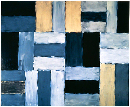
Desert Night by Sean Scully
Sunflower by Chuck Close
White Center by Mark Rothko
Interaction of Color by Josef Albers

Clearly these show my own preference—my own definition of "pretty." (And of "interesting," for that matter. These are all contemporary or mid 20th century, periods that I'm most drawn to. As my husband just pointed out, "It's interesting that so many people object to modern and abstract art. In some ways it's far more accessible than some 17th=century baroque work that's filled with religious symbols." ) But just to show you another kind of "pretty," here's a beautiful painting by Caravaggio (the epitome of baroque):

Basket of Fruit
(admittedly a very modern, minimalist baroque painting)

My point is that the two qualities can go hand in hand.


Friday, November 9, 2012

in praise of terry gross


I'm addicted to Fresh Air. On NPR's daily cultural interview program, Terry Gross has the loveliest way with her guests: She's probing but somehow not too nosy, and she's not afraid to admit when she's a fan. Sometimes that can cross over into what seems like fawning—but I'll take fawning over snide, too-cool-for-you archness any day. Fresh Air's format is definitely old school: one interviewer, one subject, maybe a five-minute book or movie review at the end of the show. Gross never condescends, and she always manages to put people at ease. Just this week she had Oliver Sacks talking about his own experience with hallucinogenic drugs: his vision of the perfect shade of indigo, he explained, was like the color of heaven. (His British lisp made the story even better.) Gross and her best subjects always laugh together: Louis CK has (not really surprising) depth; her conversations with David Rakoff are more moving than ever since his death. And her talk with Jimmy Fallon will crack you up. She's great at getting creative people to talk about their artistic process and background—Jason Schwartzman told her sweet, inspiring stories about his mom, Talia Shire. Maya Rudolph sang, and her husband Paul Thomas Anderson was charming and down-to-earth. Best ever? Maurice Sendak.

Thursday, November 8, 2012

donald baechler


I usually go for color. But Donald Baechler's 2007 Five Flowers series, though black and white, looks perfect today: pretty and edgy. Floral art needs an edge, right? (I would love to see one framed in black and hung on a gray wall.)


Baechler returns to flowers again and again. He did this beautiful bouquet in 1997:


I love the layering in this one:


I couldn't leave without one colorful image. Yes, it's blue:


OK, one more in red:


Wednesday, November 7, 2012

design project: girl's room

Despite the toys shown here,
this butterfly decal doesn't seem too babyish

A while back, a friend asked me to suggest some artwork for her seven-year-old daughter's room. She wanted a sort of gallery wall, with a bunch of different but complementary images that would look great in a group. She also hoped her daughter wouldn't outgrow any of it too soon. So I looked for art that wasn't *too* cutesy. The girl in question is girly but not princessy, is happy to look at animals (well, who isn't?), and prefers purple to pink. Here's what I chose:

Animal cards
(I told her to hang them in three matching frames, maybe tarnished metal)
Minted now makes really great prints
A valentine print, just to continue the love theme
(I'd hang them near each other)
I've admired Marisa Midori before:
her Eiffel tower is sweet

Speaking of sweet,
this is a photo of ice pops

PS: I am mostly too relieved about the election to do anything today! Such great news. I love what Sarah and Joanna wrote.

Monday, November 5, 2012

seventy tree

Semi-circles postcard

British Etsy illustrator Kerry Layton makes prints and postcards that are colorful and charming—and truly affordable. I slightly prefer her abstract and geometric shapes to her animal designs, but any or all would make a great grouping in a kid's room or playroom.


Circles print
Lines print
Blue drop postcard
Bear print

Friday, November 2, 2012

sabeena karnik


Sabeena Karnik's typographic art is nothing short of amazing. She's based in Mumbai, and she makes gorgeous, brilliantly colorful letters and other signs out of intricately folded and rolled paper. First needlepoint, now this: word art that reaches me.


Thursday, November 1, 2012

thursday thoughts: word art

I have to admit that I'm not a fan of word-based prints. They're pretty and Inspiring. But even the best ones—the ones with beautiful calligraphy or a nice clean typeface, with a message that's simple and true—just aren't my thing.

But enough with my grouchiness. I really like words in art if they're organic, incidental—or just a more subtle part of a serious composition. I've already told you how much I like Jean-Michel Basquiat and Cy Twombly, and they both use words, whether scrawled or blocked out, in their work:


Untitled


Leaving Paphos Ringed With Waves III

In terms of more affordable, accessible art, words definitely work on a poster, like these from Jason Munn, where the typography adds to the overall look and style:


Saint Etienne
Sonic Youth (it's out of print)

And this might be my favorite word print of all. I don't live in Dallas, I've never been to this shop, and I certainly wasn't at the event commemorated here. But I can't stop looking at this poster:


I think it needs to live in my playroom.
(It's not for sale online, but they'll sell it to you over the phone for $50.)