Thursday, June 27, 2013

little collector

Obey Elephant by Shepard Fairey

Something good has come out of my online shopping habit: I didn't know about this company until it showed up on Gilt this week. Little Collector is a curated selection of kid-friendly prints, many by prominent contemporary artists, with a very user-friendly online buying system. Prints come in several sizes and choices of frame (or unframed). Categories are cross-referenced, so you can search the site by artist, medium, color, and theme—say, green-based photographs with an under-the-sea theme. (It's definitely heavy on the animal themes, which is just fine by me.) It's all very bright, cheerful, and appealing without seeming dumbed-down or junky. I sure like their message:

"We are committed to inspiring the next generation of art lovers through the presentation of accessible, educational and exciting contemporary art just for kids. We believe that developing a love of art is an essential part of childhood and a fundamental creative experience."

The website even includes an "Art 101" section, with a timeline, glossary, and a few artists' biographies. It's all very sweet and worthy. 

Double Rocket by David Levinthal
Cantaloupe the Camel by Matthew Carden

B is for Baker by William Wegman
E is for... (blue) by Trey Speegle
Fisher Price People by Margaret Morrison

Wednesday, June 26, 2013

kismet tile


I don't write much about home design, but once in a while something catches my eye and I just can't forget about it. Kismet Tile works as single pieces and as installed in a group. Seriously: just a few tiles, in a row on a wall or propped behind a dresser, would work as an offbeat art object. The wallpaper makes me reconsider my anti-wallpaper bias. And the company's photography and styling are perfect. I would jump right into that pool today (and I never jump right into pools). 

Tuesday, June 25, 2013

blast from my past: hunt slonem


A long time ago—in another city, another job, a different life, before kids—I worked at a fashion magazine. For about a year there, I sat right next to a guy whose job was to cadge quippy little quotations from celebrities for our magazine's back page. He spent his evenings going to fabulous parties all over the city, interviewing people on the red carpet—and his days double-checking comments and name spellings and dress loans, dispensing gossip all the while. Thanks to the close quarters, I heard it all: who was friendly and who was a troll, who looked awful in person, whose marriage was a sham. All appearances to the contrary, this guy was a really sweet coworker and a devoted husband. Several times a day he'd take a break from this incredibly bitchy work to gurgle sweetly over the phone to his toddler son (who is now probably graduating from high school or something—that's how long ago this was). 


He'd also frequently check in with and speak highly of his older brother: an artist, as it turns out, who happens to be Hunt Slonem. He's known for large-scale paintings—his bird mural graces the Bryant Park Grill near the New York Public Library (which is a lovely place to eat if you're in midtown Manhattan).


But I'm most drawn to his smaller paintings of birds, rabbits, and butterflies. They're rendered with heavy confident brushstrokes in lush paint—all on small boards or canvases. I like their intimacy and simplicity and bold color. He's a bold character, all right: You can read more about his crazy houses (Louisiana plantations? loft with 89 rooms? what?) here.


Monday, June 24, 2013

monday thoughts: rethinking

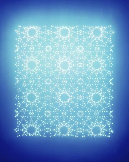
Christopher Bucklow

Erin of Design for Mankind just wrote a really interesting post about the place of design in a thoughtful life. How, she asks, do we justify our desire for new and cool and beautiful things? Why do we always crave art or clothing or great food or travel or stuff for our houses? How can she reconcile her career as a stylist and successful design blogger—and recommender of expensive items—with her distaste for all the consumerism she participates in?

Ross Bleckner

That was some wordy prose I just threw at you, and I don't have any answers. As much as I crave what's new and pretty, I get grossed out by my own cravings. I get sick of the sameness of all the fashion blogs (especially when I realize I've copied them unconsciously) but I'm compelled to check them anyway. It's really difficult not to get caught up in it. I tell myself that my goal for Blue Locket is making art affordable and attainable, which is admirable and useful. But it's still just stuff.

From this gorgeous book


Then again, I always say that stuff (or money) can't make you happy, but it can help. I really do believe in taking the time to appreciate beauty and to surround yourself with as much of it as possible. And corny as it sounds, that can take many forms—from admiring a flower in your backyard or the way the light slants across a city street at dusk, to a new pair of shoes or a pretty print for your wall. 

Friday, June 21, 2013

fredericks & mae kites


The Brooklyn pair Fredericks & Mae produce these amazing kites. Not intended for flying, they're made of materials including rice paper or kite paper, pressed flowers, and bamboo, and all have interesting stories behind them. They'd be stunning mounted on a bare wall. (Fredericks & Mae also make arrows, tassels, and the most stylish bocce balls imaginable.)


Thursday, June 20, 2013

early summer, late afternoon


Today I'm just finding art in the faces I love and the place I live. Blooms on the tomato plants and popsicles from the Good Humor truck. A mugful of Sharpies and a new fiddleleaf fig plant. Waiting for the fireflies to come out. Riding bikes at dusk.


Wednesday, June 19, 2013

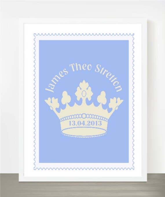
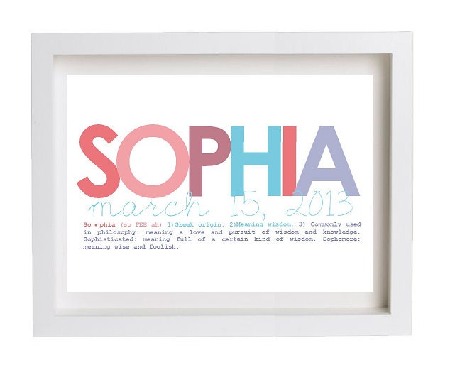
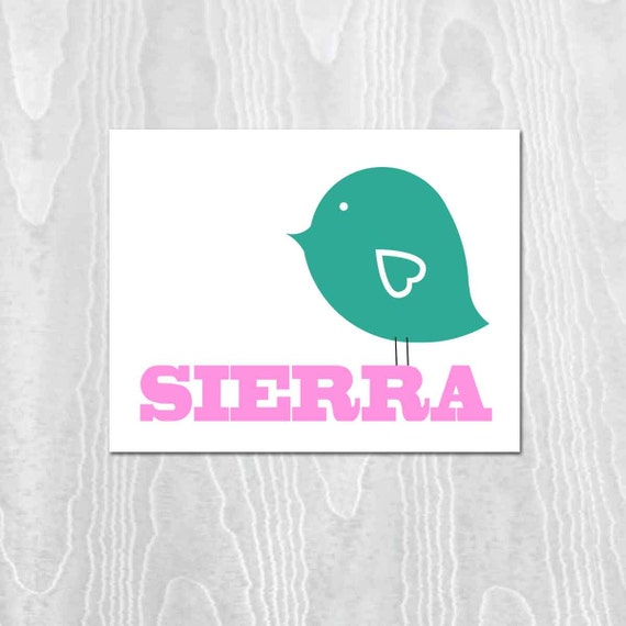
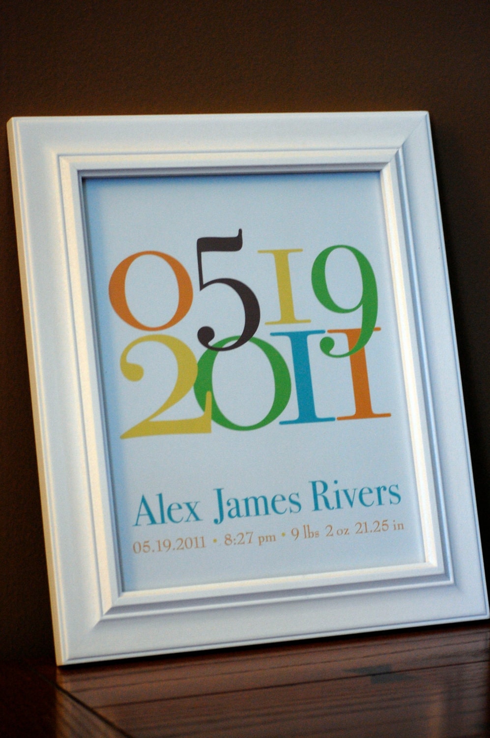
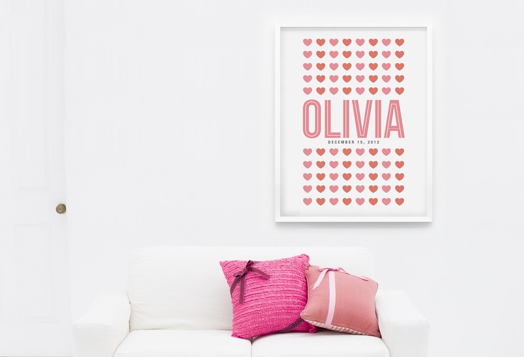
baby name art on etsy

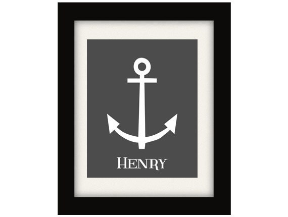
Nautical Decor Shop

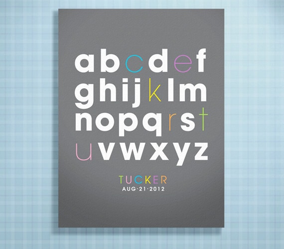
I'm shopping for a gift for a new baby, and a sweet but simple name print came to mind. It's something few parents would buy for themselves, and this child is their second, so they have all the basics anyway. These prints are all nice in various ways, but I'm having a hard time finding one that hits just the right minimal-yet-cute note. I don't like anything too gimmicky or babyish (silly as that sounds)—you don't want the kid to outgrow it before his first birthday.

Caramel Expressions
Always Sparkle Art
Bashore Designs
Pumpkin and Butterfly
Kari Machal Designs
Loopzart

Tuesday, June 18, 2013

tastes orangey on etsy

Blue Bird

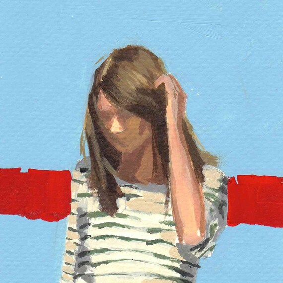
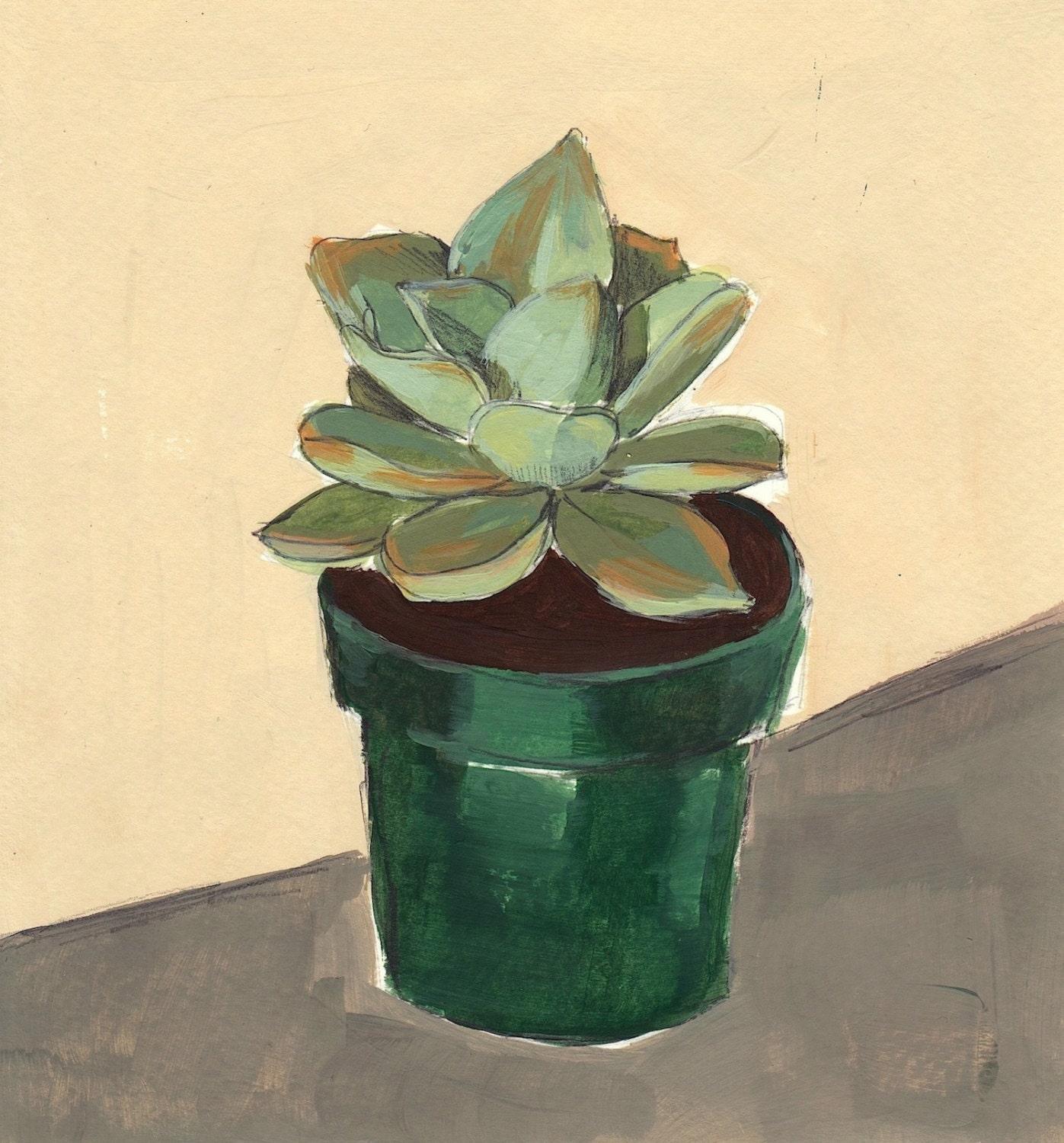
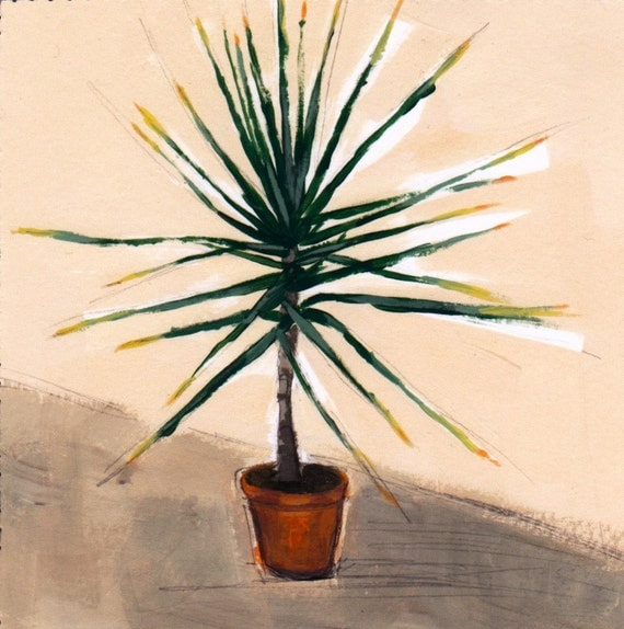
Clare Elsaesser does matter-of-fact studies of plants and obscured but lovely portraits, often of women with huge bouquets of flowers. It's all very pretty, with just the right amount of edge. Her original paintings are definitely within reach, financially—and the giclee prints from her Etsy shop, Tastes Orangey, are even more so.

From the Garden
Succulent
Portrait in Yellow
Small Yucca

Monday, June 17, 2013

monday thoughts: paul klee

Flora on Sand

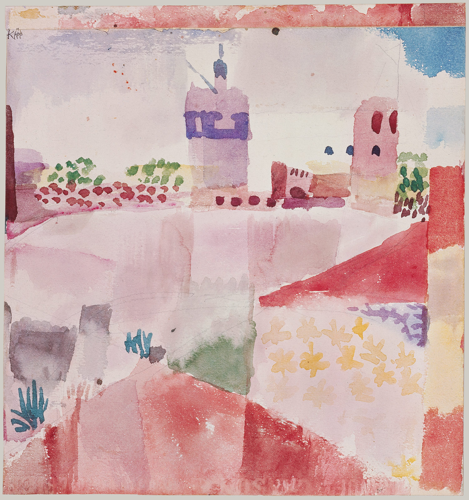
Paul Klee isn't super trendy these days. You don't see him on Pinterest or on all the blogs about beautiful stuff. But he's always been a favorite artist of mine, and it's ridiculous to talk about artists in terms of trendiness anyway. He worked in a lot of different styles—and mastered them all. Read about the Swiss artist's life here, and rest your eyes on some pieces of his work.

Fish Magic
Hammamet With Its Mosque
Senecio
Fugue in Red
Pastorale

Wednesday, June 12, 2013

vintage plates on etsy

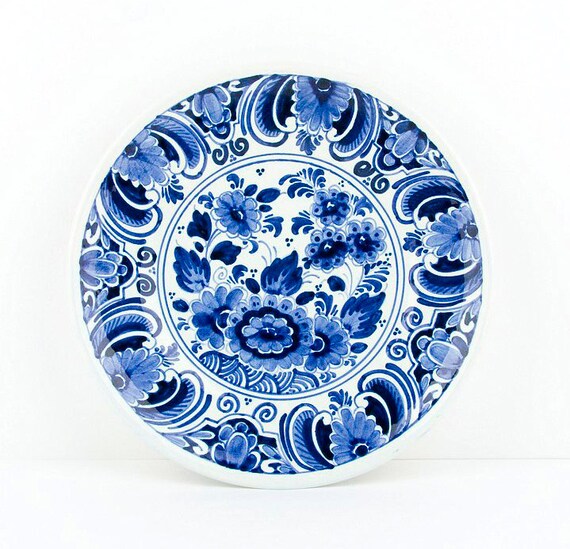
Delft plate


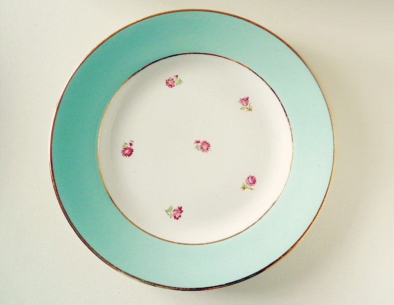
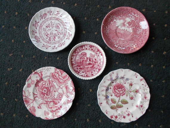
Sometimes you need a break from all the static flat paper on walls. What about plates? Kelly Wearstler's wall at the Viceroy Hotel is one great example. My mother-in-law has a mix of Mexican pottery. And Remodelista posted some beautiful groupings. You can take this in any direction (geography or period—faience, majolica, simple modern) or unify it with color. Note that I searched Etsy just to keep it manageable; eBay would be a natural source for this. That's way too big a world to do a comprehensive sample here—but this can get you started.

Turquoise French plate
Talavera plate
Ready-made matched set