I wish I could go back in time and play this song for my younger self. I mean, I love it now, but I would have really really loved it then.
Friday, March 29, 2013
vampire weekend step
I wish I could go back in time and play this song for my younger self. I mean, I love it now, but I would have really really loved it then.
Thursday, March 28, 2013
rebecca atwood
Rebecca Atwood's got a shop full of pretty (mostly blue) pillows—but it's her (also mostly blue) paintings that really caught my eye. They're sweet, well-priced little gouache and watercolor originals, with vintage frames included, in my favorite color. (Found via Jessica's always inspiring Pinterest.)
(Yes, I'm doing things a little out of order here. Spring break means lots of family travel and fewer moments than usual to sit at the computer and organize myself. After my kids go back to school, I've got some regular Blue Locket programming lined up, plus a new artist questionnaire series.)
Wednesday, March 27, 2013
nick knight: flora
I am hardly a trendsetter. But every once in a while I get lucky and spot something early on. I bought a copy of Nick Knight's Flora years ago at the New York Botanic Garden. I thought the images of specimens from the London natural-history museum were so amazing—so stark, spare and stylish—that I promptly cut out several pages, framed them, and they've hung in a group, first in my kitchen and now above my bed, ever since.
Knight has since photographed Lady Gaga for Vogue, among other things, but the power of the Flora photos stayed with him. After a show in London, some of the images are being re-released as a limited-edition portfolio. Good thing I still have my old original copy, even though four of the pages are on my bedroom wall.
Update: Nick Knight is in the atmosphere. (Speaking of art forms crossing over....) I picked up the New Yorker to finish this article about the upcoming Met show about punk and fashion, and Knight's name came up as a creative consultant to the curator, Andrew Bolton.
Friday, March 22, 2013
confetti system at moma ps1
I love it when art forms cross over. Confetti System makes beautiful decorative objects (garlands, pinatas, all with a disco-crunchy aesthetic and perfectly chosen colors) that regular people can buy at a regular online shop. They also style sites and videos for the likes of, oh, JCrew and Mrs. Carter. And now they've got an installation at MoMA's PS1. Not too shabby, no? I think a spring trip to Long Island City is in order. Or maybe I'll finally take the plunge and get this.
Wednesday, March 20, 2013
hagedorn hagen
Hagedorn Hagen (two photographers who work together) produces amazing images of beetles, butterflies, and flowers that are perfectly beautiful and creepy. They'd look amazing in a group. And I bet my animal-obsessed, surprisingly unsqueamish daughter would love them.
Tuesday, March 19, 2013
fuji arts japanese prints
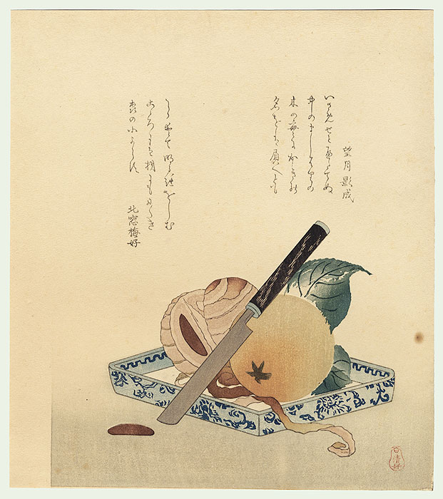
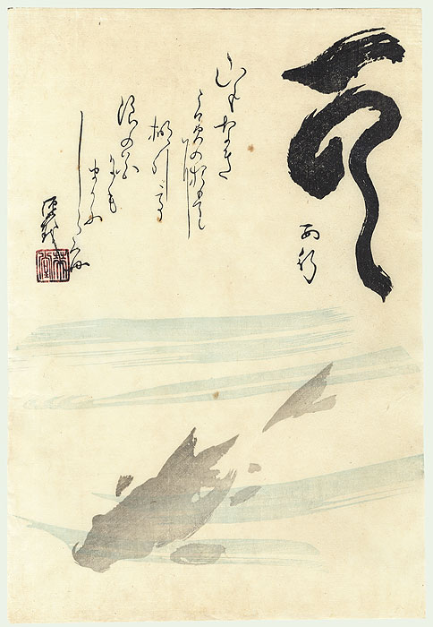
I'm back from vacation and ignoring my blog schedule. (I'm crazy like that.) Instead of a Tuesday Etsy post, I'm going with these woodblock prints from Fuji Arts. I discovered them for a client who wanted something peaceful and sophisticated for a formal dining room. Most of my favorites are from the 19th century or earlier—but so modern and simple.
Thursday, March 7, 2013
brights and logos, for a change
 |
| elSage hoodie |
I'm tired of all the gray and cold, and we're about to take a family trip to someplace warm and tropical. So these fun, old-school tops are making me happy right now, even though I usually dislike logos or other words on clothing. As I took out all my own summer stuff to pack for our vacation, I realized it was all so...black. And navy. And dark gray. I admit that I might never wear all this color (it's tricky with blonde hair—or maybe that's just my excuse), but I sure do like to look at it.
(Another thing: I've noticed, looking over these blog pages and my Pinterest boards, that I'm definitely drawn to color in art. That was sort of a surprise too—I've thought of myself as a subdued, neutral kind of person.)
Anyway, I don't know what kind of internet access I'll have while we're away, so I'll be taking a little break from the blog. Back in less than two weeks!
 |
| I don't wear red (orange?), but I like this hoodie. |
 |
| Aviator Nation baseball tee (who doesn't look good in a baseball tee, really?) |
 |
| Yes, a baseball tee. |
 |
| I do love California. |
Wednesday, March 6, 2013
snowy photographs
 |
| Finish your inventory and get back online, 20x200! (photo by the Starns) |
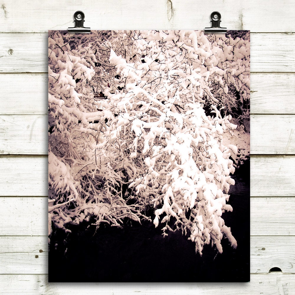
Because that's what's going on here today.
 |
 |
| MT Photo Journal |
 |
 |
| Ten Broek Cottage |
Tuesday, March 5, 2013
hoomen on etsy
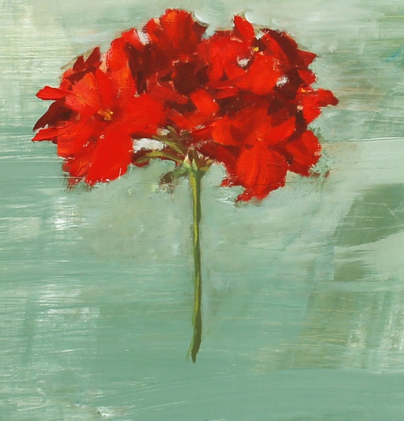 |
| Red geranium |
Hoomen makes simple, small-scale oil paintings of flowers, still lifes, and a few landscapes. With a brushy hand and soothing color schemes, their simplicity is irresistible. I tend to write about (and be drawn to) abstract or very stylized artwork these days, but these relatively traditional pieces are making my day.
 |
| Pink geranium |
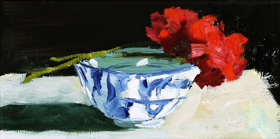 |
| Japanese bowl |
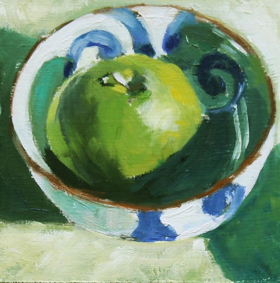 |
| Green apple |
 |
| Goldenrod |
Monday, March 4, 2013
monday thoughts: kitsch
A friend of mine recently visited the Phillips Collection with a friend of hers. My friend stood in front of this Renoir painting, moved and awestruck. She turned to tell her friend how beautiful she found it—and her friend's response was something like, "Ugh, it's so kitschy. You actually like that?" IS it kitschy, my friend asked me a few days later. She really wanted to know: Was her response in bad taste? uneducated? just plain wrong?
I don't think so. First of all, art is totally subjective. One person's "kitsch" is another's masterwork. I might think Renoir is a little sentimental—but that's because I've already seen tons of his hazy, pastel young girls surrounded by flowers, not to mention all the bad reproductions and even worse imitations. But someone else might find them lovely and fresh and just plain pretty (and you know where I stand on pretty: staunchly pro).
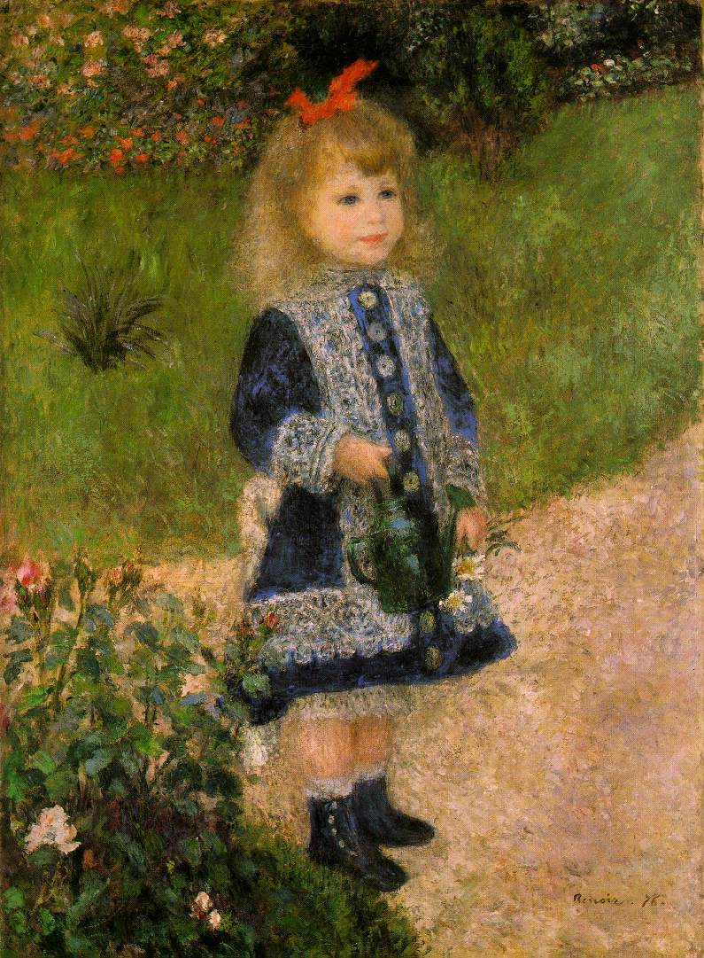 |
| This might be a bad example of "sentimental" Renoir; after all, I like the straightforwardness of the composition |
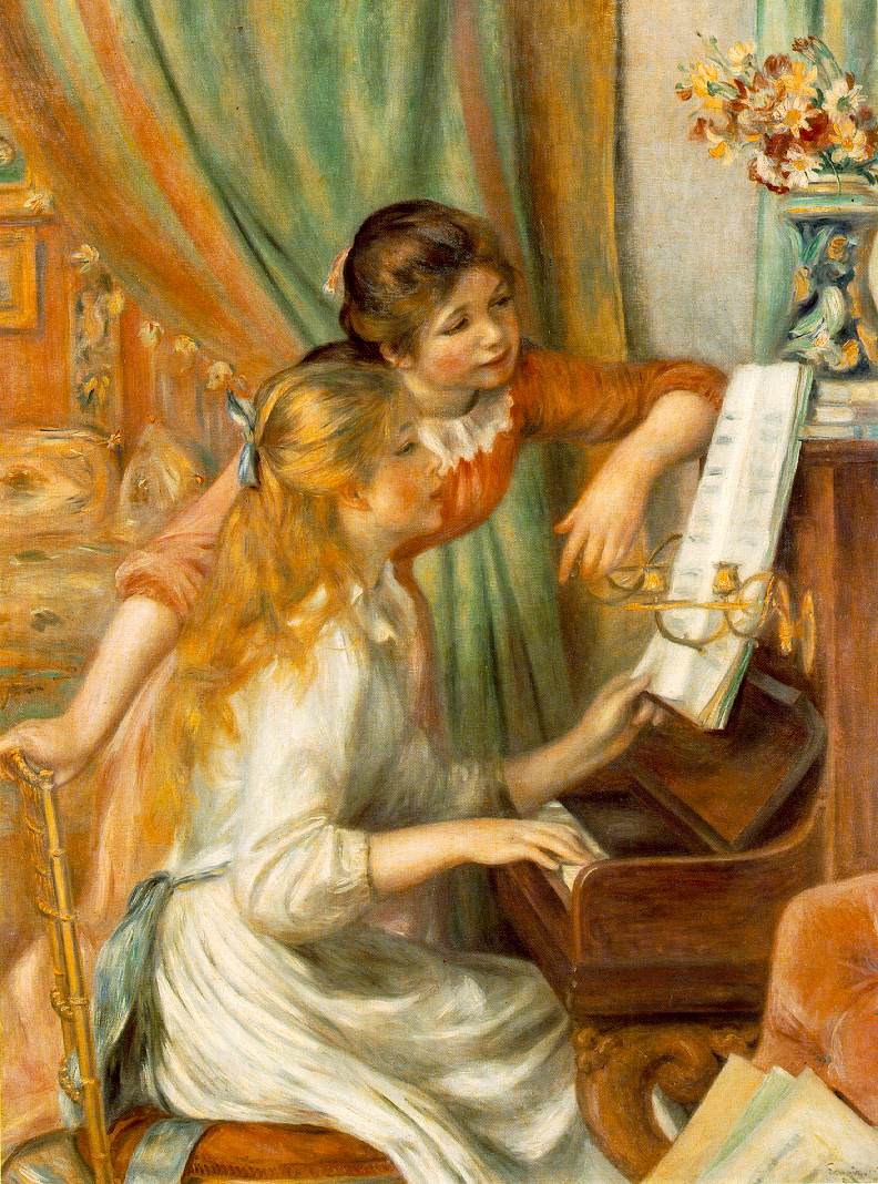 |
| Rosy-cheeked girls, check. Pastel color scheme, check. Flowers in a vase, check. Leisure-class activity, check. |
But "Luncheon of the Boating Party" *does* appeal to me, in a way that those gauzy girls don't. It's got contrast and intrigue and tension in its composition. You might find it busy and annoying. We're all correct—that's all I'm trying to say.
Subscribe to:
Comments (Atom)


