Friday, November 30, 2012

design project: bedroom update


We recently made a few small but long overdue improvements to our bedroom. We had the walls painted dark slate gray. We got a new flat-screen TV and had it hung on the wall, because our old one was so small that I could barely see it from the bed, even with glasses on. And we threw out all the sad little piles of stuff cluttering up the corners—and finally hung some art that had been propped behind doors or stashed in the basement. I'd still love to add a few things: a new rug (our old striped one is too small); new bedding (ours now matches the walls—too much gray); and some sheer white curtains. And I'm torn about that corner, above: I like the blank space—but I could also see a second framed artwork next to the Joshua Davis print. (I'm thinking Perla Anne would fit the mood.) But we're almost there. And it's sooo much better than it was.

We've had these photos here for years.
But they look a million times better against a dark color instead of blah white.
The white trim works great with the dark walls.

Thursday, November 29, 2012

a birthday


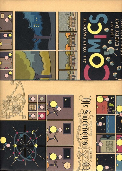
Not mine! RP has a significant one today. Happy birthday to the best husband! I got him a Dan Clowes first edition and a Chris Ware print, both from the amazing Heather O'Donnell of Honey & Wax books. (I like all those graphic-novel boys just fine, but RP has *loved* them forever.)


Wednesday, November 28, 2012

sneak peek: blue locket website


Jamie Kleiman, a talented Brooklyn designer, has been working on a website for me, with access to this blog as well as all the details on my art consulting work. I know this is just a tiny, hard-to-read preview, but I had to share. (I especially love the logo she designed.) And of course I'll let you know when it's up for real.

Tuesday, November 27, 2012

frazier & wing mobiles


Kelly mobile

Frazier & Wing makes beautifully spare mobiles. They definitely appeal to the little ones, but I could see them in any room. How about a light-filled living room? Heather, the Portland-based designer, has a great sense of color and scale. And her styling is totally inspiring. (For a similar look, check out Puka Puka Design, an Australian firm.)

Georgia branch mobile
Flynn mobile
Snow mobile
Ava mobile
Puka Puka's Marine mobile

Monday, November 26, 2012

national building museum: house and home

One house represented in the show
(and I have a thing for Sausalito houseboats)

We stopped in at the National Building Museum over the holiday weekend, intending to see this building-toy exhibit—and after a few so-so minutes spent with blue foam blocks, we wandered into House and Home. This show contains photographs and models of all kinds of homes, both generic (suburban split level) and quite famous (Fallingwater, the Glass House). The best part? A film, set to music and with no narration, of different families and individuals in their homes, from a lavish Tucson desert spread to a mini (really, really mini) house in backyard. My kids sat mesmerized for the whole thing, which is saying something. And I was sorry it didn't last longer.

Tuesday, November 20, 2012

moomah magazine

Cute project: kid-made glitter shells

I never actually made it to Moomah when it was a cool little kid-friendly cafe and art space in Tribeca, founded by Tracey Stewart (who is probably tired of being identified as Jon Stewart's wife). And though she closed the cafe, Stewart writes, there was still some Moomah in her: "While that joy of providing such a place for our community was thrilling, we yearned for an even bigger community and a way to make more of a difference." I always admired Moomah's mission and its style, and I'm pleased that it's now a magazine, with beautifully designed stories about living artfully with kids.

There's a piece on how to come to terms with kids' clutter
I love the instructions for this geometric painting
(and the results)
The "girl (and boy) crush" column features this Danish artist,
who does inspiring, beautiful work with flowers

Monday, November 19, 2012

amelia herbertson on etsy

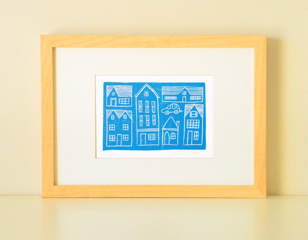
Blue houses print

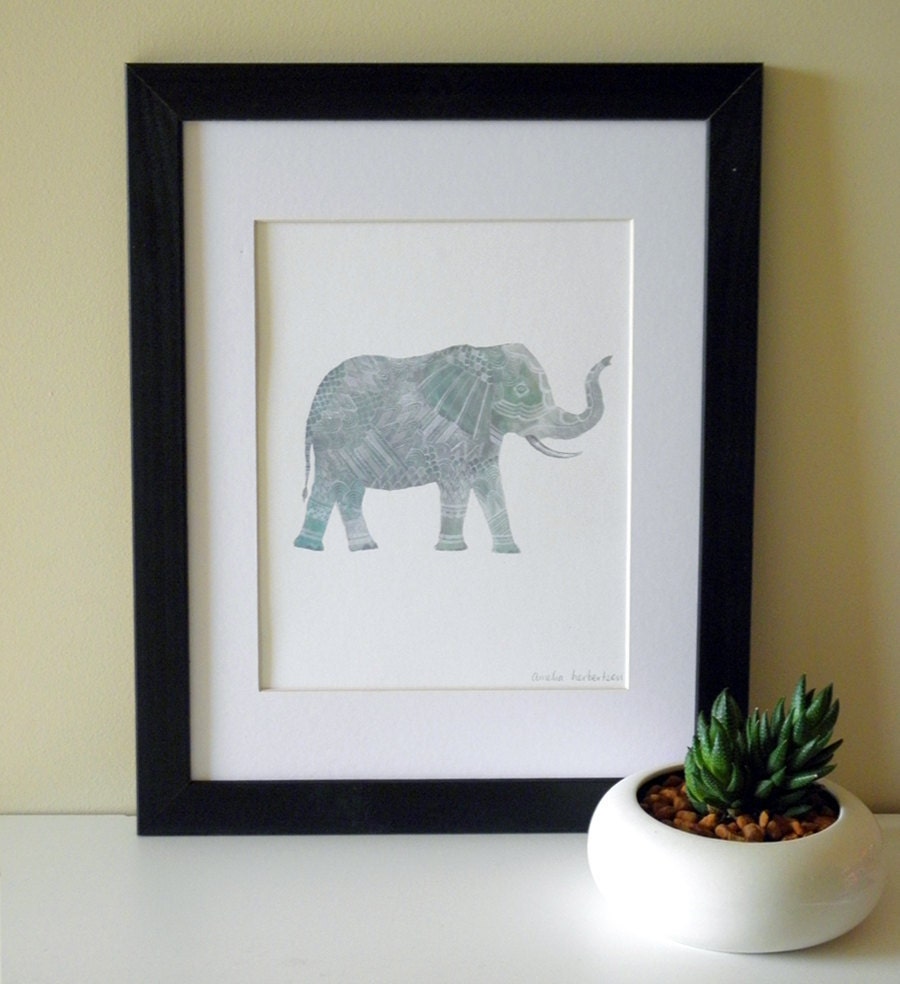
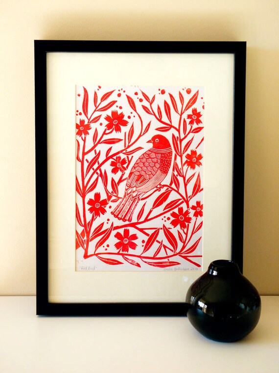
Australian artist Amelia Herbertson's work—block prints of animals and nature, often in beautiful vivid color—is just the thing on a grayish, coldish Monday.


Four fish print
Elephant print
Red bird print

Friday, November 16, 2012

wish list: grown-up edition

I'm pretty sure we'd all play with a Kaleidograph.

Here's a (slightly) more grown-up edition of yesterday's wish list. (In our family, a lot of birthdays coincide with the holidays, so there's a lot of gift giving—or at least list making.) I wasn't going for any themes, but now that I look this list over, it's all "accessories" (silly word, come to think of it), plus one piece of art. And there's a lot of pink and blue.

RP asked for not-too-heavy gloves,and these have smart fingers. 


Also for RP, this stays just on the right side of "man purse."


I've had my eye on this Clare Vivier clutch for months:


This perfume smells lovely:
So does this. And this.


Much of Rachel Castle's recent work has been sold, but not this beautiful piece:


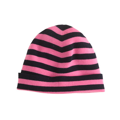
 I'll wear this JCrew hat, especially if Charlie refuses his:


This is neither blue nor pink nor an accessoryjust for me:


Thursday, November 15, 2012

wish list: kids

What's that? Your little girl doesn't want a stuffed T-rex?

I'm not much of a gift-guide kind of girl. So instead I give you a wish list. Here's what the kids are craving around my house. (Up next: what RP and I want.)

This would be the coolest pet ever:


 I think I'd want this series even if I didn't have a daughter:


 Lego Minecraft is mostly sold out, but you can find it online (way marked up):


Maybe, just maybe, I can get Charlie into this striped hat:


Lemony Snicket is back:


And I can't leave out a piece of art:

Tuesday, November 13, 2012

me elsewhere: design mom


Today the amazing Gabrielle is featuring my house on her fantastic blog, Design Mom. Everything about Design Mom is beautiful and creative, and Gabrielle's Living With Kids series always inspires me. Gabrielle, thank you so much! 

A few other sights around my house making me happy today:


Monday, November 12, 2012

monday thoughts: in defense of pretty

Night Blooming Cereus by Sally Mann

There are so many ways to label art. Is it fine art? decorative? One of the worst things you can say about a work of art is that it's pretty. Pretty art gets dismissed. Pretty art is boring. In other words, if it's not ugly or provocative, it's not important—it's not real art.


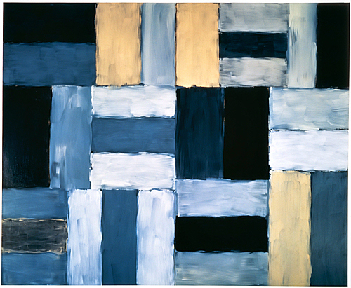
Well, I reject that. Art can be pretty. These works are interesting and also just plain beautiful:

Blue Horse by Lily Stockman
(see also Susan Rothenberg's horses)
Desert Night by Sean Scully
Sunflower by Chuck Close
White Center by Mark Rothko
Interaction of Color by Josef Albers

Clearly these show my own preference—my own definition of "pretty." (And of "interesting," for that matter. These are all contemporary or mid 20th century, periods that I'm most drawn to. As my husband just pointed out, "It's interesting that so many people object to modern and abstract art. In some ways it's far more accessible than some 17th=century baroque work that's filled with religious symbols." ) But just to show you another kind of "pretty," here's a beautiful painting by Caravaggio (the epitome of baroque):

Basket of Fruit
(admittedly a very modern, minimalist baroque painting)

My point is that the two qualities can go hand in hand.